January
Re-merch of the mezzanine
2017
December
Trying something a little different with the masks and merchandising them horizonterly rather the vertical.
November
Creating a section of higher end products at the back of the store with suits and the grand heritage range.
The Amscan Party section back in place after Halloween.
July
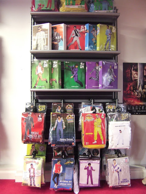
Stand Out Suits and Oppo Suits displayed where the shop once four computers used to be (for customers to look at hire costumes and the web site)
Being a visual focal point its a great place for the suits to be displayed.
May
Had a move around of some of the party supplies.
I put all of the generic coloured party table wear on to one of the large walls rather then on two of the small units so it was more at shoppers eye level to increase sales. (Which worked and we practically sold out with in 3 weeks)
January
Wig display of the slightly higher end wigs
This far back corner is a very forgoten wall. Were so far most products had gone to be forget and die.
So at the beginning of this year I decided to move all the items that don't need a huge push, such as capes, tutu, and T-shirts and put them in 'The dead Zone'. Which has so far worked well.
2016
(December)
Before And After.
Display cabinet for Venetian masks
Christmas time. A strong and prominent Santa costume display beside the stairs.
Brighting up the piller with a 'Stranger Things' display.
 |
| Photo from my Instagram account. Instagram.com/101_vm |
The above photo is of the accessory and hat wall on the mezzanine, before a re-merch'.
and the below photo is of after.
Moving the self half way up the wall serves two purposes. The first is that the merchandise is now at eye hight for costumers to see rather then being hidden at the bottom, where they have been hidden.
Placing the large witches hats at the top makes better use of the high wall. Rather then merchandising the smaller items at the top where costumers are unable to reach and see properly.
The second purpose is that the slat wall is broken at this point meaning that we can not put arms at this level without damaging the above slat and stock fulling off the arms, making the best of broken fixtures.
On high walls like this rather then merchandising small items at the top and larger at the bottom, try merchandising large items at the to smaller in the middle and large/medium at the bottom.
Halloween 2016
(August)
Above is the in store display cabernet which reflects the window carnival display inspired by the Notting Hill carnival (window display below).
(February)
Making the Childrens' department bigger, ready of World Book Day. (march 3rd)
2015
(December)
Creating a rainbow with the Grimas face and body paint.
(October)
(June)
Really quick waldrobe display using some hire costumes and display heads.
Decided to cover the heads with fabric as the faces are looking a little weatherd. The now look a little freaky but it kinder works.
I flipped the floor gondola around so as you look at the film and TV section you see the Starwars section on the gondola, with animals on the back. So as you walk towards the section you see everything rather then the Starwars products being hid on the back.

(January)

Halloween 2014
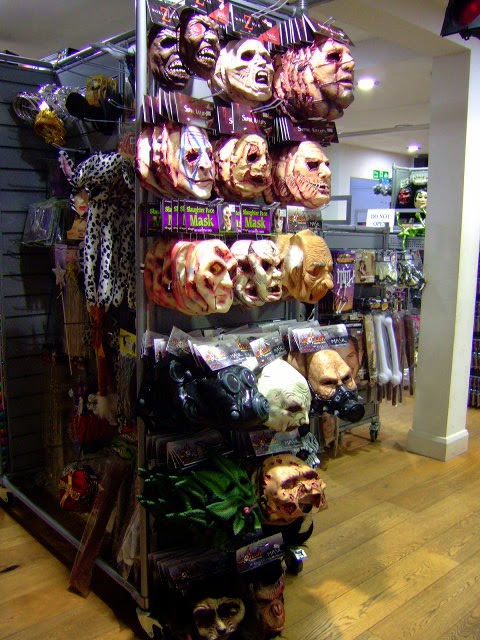
Setting up the mask wall for Halloween
(September 22nd 2014)
Setting up the Mask wall Halloween is always, I find a joy. There are so many gruesome face looking back at you, from Pennywise, Freddy Kruger, Jason, and many more horror villains.
Its a little easy to forget that the companies that make these marks made them for the actual films.
Company's like TrickOrTreatStudios.com have the artist that create effects make up for The walking dead. and masks for Jeppers Creepers, Killer clowns form outer space. the list goes on and on. Seeing these masks that are created by the original designers is a true pleasure. As it something as a child I wanted to do.

(Tuesday 16th- Wedsenday 23th 2014)
Setting up for the Halloween season
Creating a little black and red wall, with a hint of blue for Halloween.
Licensed horror wall taking shape on the right.
General every day license wall.
Fancy a bite? four styles of fangs set up ready and waiting.
A wall and shelfs of make up, ready for high sales with low storage space the more products that can be put out on display is good for two things,
high sales saving time having to fill up spaces every half an hour,
and that means more space to store any stock that is a slower seller, giving more space for those that sell faster, and are demanded more.
Due to the size of the packaging you can only put between 3 to 6 items per arm on the wall, meaning constant attention is needed to keep it fully stocked.
Dur to different suppliers the length of the packaging vary, so it involves a lot of shifting around to keep things looking visual pleasing, with stock in straight lines vertically as well and horizontally and keeping the spacing neat.
2014
Escapade 2013
September
Before:
And After:
2012

Halloween 2011
2011


No comments:
Post a Comment